K-Meleon
Home > Screenshots > ScreenHistory
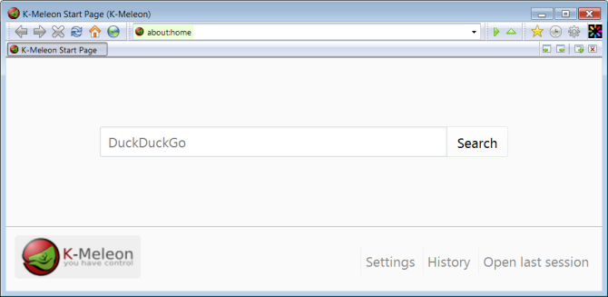
K-Meleon 74.0
K-Meleon 74.0 out of the box (image-1)

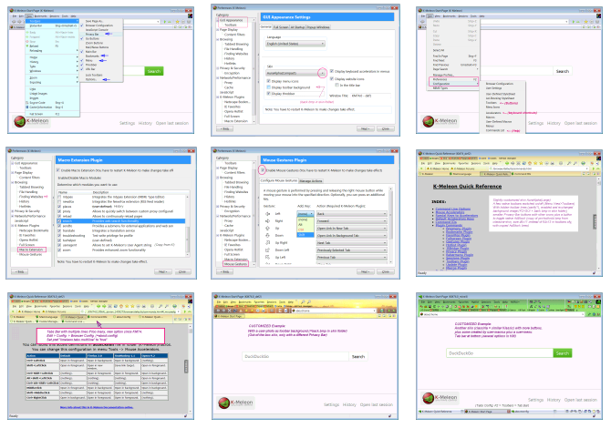
More screenshots, last 4 are customized as example
(image-2)
(image-3)
(image-4)
(image-5)
(image-6)
(image-7)
(image-8)
(image-9)
(image-10)

Playing with large and fancy Windows System fonts (just as test)

K-Meleon 1.5.4
Note: K-Meleon 1.5.4 looks pretty much like 1.5.3 out of the box.
So here's just one shot that goes to show that K-Meleon can be customized to suit various UI wishes.
Here's K-Meleon customized -

with Bookmarks & Privacy Bars enabled, no throbber, no URLBar Title.
Some buttons & toolbars hidden, personalized window title.
The Main menu is hidden behind the Preferences button and shows up at long-click (popular to save space.)
K-Meleon 1.5.3
Here's K-Meleon 1.5.3 out of the box

K-Meleon 1.5.3 with the preferences panel open

IE Favorites, Opera Hotlist, and Hotlinks instead of Bookmarks with five tabs open

K-Meleon in the Klassic skin with the document popup menu showing

Phoenity(large) skin with privacy bar displayed, tab menu and tab bar at the bottom

External: Wanna drown in screenshots? Over 60 huge ones...
can be found on Softpedia, for nearly all menus and preferences tabs!
K-Meleon 0.9
Here's K-Meleon 0.9 out of the box with all 3 bookmarking plugins enabled

Toolbars re-arranged, locked, Hotlist-plugin disabled and about to open Preferences

Preferences - Plugins. Just disabled Favorites and Layers, Hotlist already was

Had fun with the View - Toolbars menu (notice the Privacy bar!)

There's also a larger version of the new, default skin (Phoenity)

Revealing even more options in 0.9 through right-clicking (on go-button, here)

K-Meleon 0.8
Note: These screenshots are from the older version 0.8. K-Meleon 0.9 has a new default skin (Phoenity) and better overall user interface. The old, now so-called "Klassic" skin will still be available (Edit - Preferences) and it will include all enhancements through added icons.
Here's K-Meleon out of the box

Here's K-Meleon changing its colors

Again...

And again

Controlling K-Meleon

Early versions
Version 0.7

Version 0.6

Version 0.5

Version 0.3

Version 0.1


 English